My girlfriend and I have been together for more than four years. We are a happy, normal couple. We love, we laugh, we occasionally disagree, we call each other names, we sometimes agree in the end, but most important of all: we make it work. I can honestly say that I’m happy in love. This is confirmed by the scatter chart below, which is a result of this thorough analysis. I will cover exactly how I was able to create this graph (and more!) in this article.
Contents
A brief introduction
So I can honestly say that I am happy in love. But can I actually support this statement with proof?
I have been tracking my happiness for over 3,5 years, including the influence of my relationship on my happiness. Who am I to boldly claim that I am happy in love if I don’t even have the data to back it up? Therefore, I have analyzed all my data and created something that is truly insightful to me. And I now want to share it with you.
What am I looking to prove?
After tracking my happiness and relationship for so long, I want to find the answers to some questions that I occasionally think about:
- Does my relationship increase my overall happiness?
- Can I determine the best and worst periods of our relationship via my data?
- Can I quantify the exact effect that an event in our relationship (argument, holiday, dinner etc.) has on my happiness?
- Subsequently, which of these factors has the biggest effects?
- I can imagine that a serious fight has a far bigger impact on happiness than a lovely weekend together.
Additional parts?
During this post, I will try to find the answers by using my data. Interestingly, I can easily think of plenty of follow-up questions.
For example: how does a Long Distance Relationship affect happiness over time? Does a happy relationship require frequent fun activities (romance, holidays, dinners etc.)? Is the happiness in my relationship correlated to a season? I should be able to answer these questions as well, based on my data. These topics are going to be analyzed in additional parts to this post.
I feel like I also need to add some sort of disclaimer. Of course, these results are all based on my personal situation. Therefore, my observations and results are not necessarily applicable to your situation.
Also, this is by no means an exact science. However, the big amount of data does allow me to do some quantitative analysis.
Quantitative analysis
I started collecting this data on the 1st of December, 2013. This post is based on every single day of data I tracked, until the 23rd of June, 2017. That’s a total of 1,301 data entries. Plenty of data to analyze, in my opinion.
The start of my relationship tracking
Let’s take a look at the chart below. This chart shows every day of December 2013, in which my happiness was affected by my relationship.
I started tracking my happiness during this period. I have tracked exactly what influences my happiness every single day, including my relationship.
The blue dots represent the days that were positively influenced by my relationship. For example, I spent the entire weekend of December 15th with my girlfriend and her family. These days were a lot of fun and had a positive influence on my happiness.
Similarly, the red dots represent the days in which my overall happiness was negatively influenced. Some days were not influenced by my relationship at all. I have included comments in the graph to add some context. It’s all pretty straightforward.
You might notice that this is a pretty basic quantitative analysis. Think of it as keeping a scoreboard. Every positively influenced day will score a point for my relationship. The negatively influenced days will reduce this score.
How can I turn this basic set of data into something that is more visual?
Visualising my data
The chart below shows the same data, but with added lines!
These lines represent the weekly moving average count of influenced days. On the 7th of December, the blue line has a value of 2. This value is calculated by counting the number of days that were positively influenced by my relationship between the 4th and the 10th of December. Feel free to click on any of these points to double-check my math here.
This graph is already quite a lot better at showing my happiness in my relationship. You can probably see that the last couple of days of the month were very positively influenced by my relationship.
Quantity over quality?
You may also notice that I’m only looking at the quantity here, not the quality. I’m not weighing these data points at all. Even though the confrontation I had with my girlfriend on the 12th of December might have been a lot harsher than the argument on the 21st, I’m not appointing different weights to these days.
I now hear you think, “But won’t that distort and skew the data and its results?!?!?!!!1?” Well, I believe that the size of my data set is large enough to compensate for any small spikes and dips. We are talking about more than 3,5 years of data here, so any noise in the data is likely to be smoothed out.
Anyway, I would love to be able to show the status of my relationship in a single metric.
The happiness ratio
And therefore, I will introduce you to the happiness ratio. This is a very basic metric, which is calculated by dividing the blue line by the absolute values of the red line. Simple as that. I have charted this metric in the graph below.
I need to address a few exceptions to this formula:
- If there is no influenced day at all within a 7 day period, the happiness ratio will be neutral (1).
- If there is no negatively influenced day within a 7 day period, the happiness ratio will be equal to the number of positively influenced days plus one*.
- Finally, if there is no positively influenced day within a 7 day period, the happiness ratio will be equal to 1 divided by the number of negatively influenced days plus one*.
* The ‘plus one’ makes sure there is a difference between a week with 5 positives and 0 negatives and a week with 5 positives and 1 negative. Without the plus one, the happiness ratio would be equal for both weeks.
As you can see, the weekly moving happiness ratio does a pretty good job describing the status of my relationship. When this metric drops below 1, it means that my relationship causes me more mishap than happiness within a 7 day period. This usually means bad news. Simultaneously, a high weekly happiness ratio signals a very happy relationship, with the maximum being an 8. For example, the happiness ratio on the 29th of December was a 6, since only 2 days within the 7 day period were not positively influenced by my relationship.
I have also plotted the monthly average of this happiness rating. This metric will turn out useful when analyzing the full data set. We’ll get there in a minute, I promise!
Overall impression of December 2013
I have created this wonderful pie chart below, which shows the number and percentage of all the days in December 2013.
Almost half of the days in December 2013 were not influenced by my relationship. However, out of the 17 days that were influenced, the biggest part was luckily positive. As long as the blue piece of the pie is significantly bigger than the red piece, my relationship will logically be a source of happiness in my life.
💡 By the way: If you want to start feeling better and more productive, I’ve condensed the information of 100’s of our articles into a 10-step mental health cheat sheet here. 👇
This Cheat Sheet Will Help You Be Happier and More Productive
Thrive under stress and crush your goals with these 10 unique tips for your mental health.
All pretty easy, right?
Let’s zoom out and have a look at the entire data set!
The entire set of raw data
I have created the same charts as before, starting with the basics below. Please be aware that the charts are very wide, so feel free to scroll to the right to view the entire thing. Again, I have included some comments here and there to add context where necessary. For example, my girlfriend and I have survived multiple stretches of long-distance relationship (LDR) periods.
As you can see, there’s a lot more blue than red in this chart. Great!
You can probably also see that the blue and red points are shifting a lot in density. Let’s see how that translates to the weekly moving average count of influenced days!
You can see here that my relationship has been quite a roller coaster ride. There have been some long periods where my relationship score was negatively influenced a lot. Luckily though, the blue line still reaches a lot higher in general. Especially the last year has been absolutely great for my girlfriend and me.
I will add some context to this data after I show you the chart with the happiness ratio.
This graph shows all the weekly moving and the monthly average happiness ratios. The monthly average happiness ratio does an exceptional job at explaining the overall state of my relationship during any period. Again, feel free to look around at the specific periods within my relationship.
Some context on my relationship
To add some context, I will briefly explain some key periods within this chart:
- Summers of 2014, 2015, 2016 and 2017: Holidays with my girlfriend had a huge positive influence on our relationship and my happiness. Awesome times!
- From January 2014 to June 2014: Long Distance Relationship period where I traveled to New Zealand. We got through this period relatively easy, considering we didn’t see each other for 5 months. We communicated well together and didn’t have a lot of arguments.
- From September 2015 to February 2016: Long Distance Relationship period in which my girlfriend traveled to Australia for 5 months. This period had a very big negative influence on our relationship and my happiness. Our communication was terrible in general, and it threw our relationship into a deep pit. It’s what I have been referring to as relationship hell.
- From February 2016 to May 2016: Even though we survived the LDR period, we still had to climb out of the deep pit in which our relationship was at the time. It took a long time, with many ups and downs, but in the end we survived. We haven’t experienced a disastrous period like that ever since (I’m knocking on wood here). In hindsight, I tend to think these periods made our relationship stronger, even though times have definitely been tough.
Relationships are always challenged
What I have learned from this data and my time together with my girlfriend, is that our relationship experienced quite some ups and downs. I believe that’s true for every relationship. It’s how relationships work. The key to a healthy relationship is to both be aware of this, and work for each other during the dips. So if you recognize a similar roller coaster experience, don’t worry. In my opinion, it’s how relationships function.
“We decided to fight for what we had”
My girlfriend and I have survived a terrible period together. The happiness ratio was below 1 for a long period. It had obviously been below 1 before, but never for this long. We both openly discussed breaking up at one point. You know, whether breaking up would actually be a good decision.
In the end, we decided to fight for what we had, because we both knew that our relationship had great potential. Sure, we were in a deep pit, but we both knew that the great periods together were something worth fighting for.
After all, I had all this data telling me that this relationship had great potential. I couldn’t ignore it.
And I don’t regret it one bit. Have a look at the last year of data and you will know why. We are both happy in our relationship and have enjoyed each other’s company month after month.
It makes me think of something Bob Ross used to say on his painting show.
“Gotta have opposites, light and dark and dark and light, in painting. It’s like in life. Gotta have a little sadness once in a while so you know when the good times come.”
This kind of self-awareness has been extremely valuable to me, and I have tracking happiness to thank for it. Knowing (and accepting) that my relationship will always have its ups and downs is one of the key benefits of this self-awareness.
Overall impression of my entire relationship
What this shows, however, is that I can use the happiness ratio to confidently calculate when my relationship was at its peak. I can determine the state of my relationship through my data.
The pie chart below shows the entire data set.
The blue piece of the pie is much bigger than the red piece. Phew!
I feel like I need to address the big number of days that weren’t influenced at all. Me and my girlfriend have not been living together throughout this entire period. We both shifted between different countries, living at home and living near our university.
On average, I think we see each other about 3,5 times per week. This might explain the relatively large grey piece of the pie. We are planning on finding an apartment together, and once that happens, I expect the grey area to become smaller. Hopefully, the blue piece of the pie will not shrink relative to the red piece due to moving in together. But only time will tell. It will be the topic for another interesting post in this series, though!
Anyway, the pie chart confirms that my relationship has a positive effect on my happiness. Looking at the percentages, our relationship score tells me that we are winning by approximately 5 to 1.
All this data will obviously be different for any other couple, but the main takeaway here is that the blue needs to be bigger than the red. Want to know how your relationship ranks? Just start tracking your happiness.
I know now that I can confidently determine the state of my relationship via quantitative analysis.
But is there a way for me to add some qualitative analysis here as well?
There actually is. I have been rating my happiness all this time, which means that I have determined a qualitative value for each and every single day during this entire period.
Qualitative analysis
I have plotted my happiness ratings in the chart below, in addition to the happiness factor. There are multiple additional lines here: light blue represents the actual happiness rating for these days, darker blue is a trailing average and darkest blue is the monthly average happiness rating.
As you can see, the monthly average does a pretty good job at showing the overall trend in the data. However, there are a lot of smaller spikes and dips which are buried this way. I don’t want that! I want to see how these spikes and dips are cooperating and influencing my happiness.
Therefore, the chart below shows the same set of data, but the monthly averages have now turned into weekly averages. How convenient, right? 🙂
You can see that the big spikes and dips in my happiness ratio are frequently affecting my general happiness. For example, on the 23rd of May, 2015, my girlfriend and I were on a holiday to Croatia. The average ratio during this time was at a maximum value of 8. My average happiness rating was also near all-time highs, and this is no coincidence. There are a lot of spikes like these in this data set, and a lot of them are correlated with each other.
The same works for the dips. For example, when I was in relationship hell, the ratio was far below 1. I was not exclusively unhappy during this period, but my general happiness was severely impacted nonetheless.
Of course, not all dips in my happiness are correlated to my happiness ratio in my relationship. The happiness ratings are influenced by every single factor in my life. There’s virtually an endless number of factors that could potentially influence my happiness. My relationship is a big factor, indeed, but certainly not the only one.
For example, during the week of 28-06-2016, my happiness dropped significantly, without my relationship having an influence whatsoever. This was due to me going to a rock festival in Belgium, where the weather sucked so badly, that it was simply impossible for me to be happy. My relationship didn’t influence this.
But I can still see that my happiness ratio in my relationship is somewhat correlated to my general happiness. Of course, I want to know just how much exactly!
Correlating my relationship to my happiness!
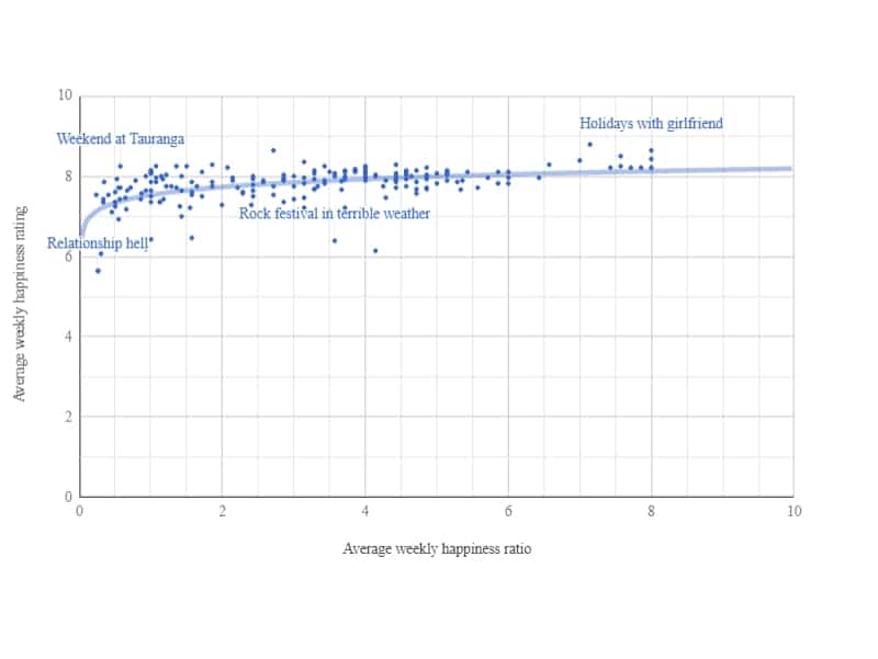
Therefore, I have created a scatter chart showing every week of data that was charted in the previous graph. This is the same graph that I have animated in the abstract of this article.
What this shows me is that my relationship happiness ratio is significantly correlated to my general happiness. So in general, I’m a much happier person when my happiness ratio from my relationship is above 1. It’s probably the single biggest influence on my happiness (and therefore my life?). However, this is something that I can only confidently claim when I have analyzed other factors as well.
Please excuse me for using some tricky math here. I have calculated the Pearson correlation coefficient, and it shows a positive correlation of 0,46! This is obviously not a perfect 1,0 but is definitely significant nonetheless. It will be very interesting to see how the correlation between my happiness and relationship compares to other factors.
Anyway, the best weeks of my entire life were made possible by my girlfriend. These weeks are visualized at the top right corner of the graph. It’s the bunch of weeks in which my happiness was at all-time highs while being around my girlfriend for most of this time.
“The best weeks of my entire life were made possible by my girlfriend”
There are also a couple of weeks that do not follow the trend, at all. Some of the weeks were terrible, despite my girlfriend having a positive influence. These are visualized in the upper left of the chart, where my happiness ratings were low but my relationship ratio was very much positive. For example, I was struck with the flu on week 10, 2015, which made me feel quite miserable. Still, my girlfriend was there to take care of me and cheer me up!
Also, during week 18, 2014, I traveled to Tauranga and McLaren Falls Park for a camping trip in New Zealand with my friends. It was a fantastic week overall, while in the meantime, my relationship did not positively influence it. There are obviously many more weeks like these, and they lower the correlation between my happiness and relationship. As I have said before, it makes sense since there are too many other factors (sickness, weather, traveling etc.) that can influence my happiness.
Loss aversion in relationships?
Humans are loss averse. It means that we dislike losses more than we like equal wins. More precisely, we dislike losing $5,00 more than we like winning $5,00. There are numerous highly informative studies on this topic.
I have created the picture below to help explain this theory.
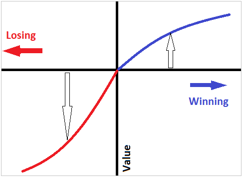
What this means is that a loss has a bigger negative value than the positive value of an equally sized win. It’s how we humans work.
“We dislike fighting more than we like cuddling”
I absolutely believe this is applicable to relationships as well, in some way. The damage done from a negative experience (argument, fight, bad communication etc) is bigger than the good that comes from an equally positive experience (nice date, holiday, laughing together etc). In other words, we dislike fighting more than we like cuddling.
As I’ve said before, this is not an exact science. There is no way for me to exactly determine the impact of any event within a relationship. I might be comparing apples to apples, but am I really comparing apples of the same size? Absolutely not.
However, I do have a pretty big set of data, which helps me see the bigger picture. I have over 3,5 years of data on my relationship. Sure, the events within this time period have had different impacts, both negatively and positively. But since I am using a big data set here, these different influence sizes will regress to the mean and be statistically useful.
Look at it this way: let’s say I want to calculate the average weight of apples from two different shipments. If I weigh a single apple of each shipment, the difference can be huge. Therefore, I will not be able to determine whether the average weight of shipment A is better or worse than shipment B. However, if I weigh all the apples of each shipment in bulk and divide that by the number of apples, I will be able to accurately tell the difference in average weight between both shipments.
And that’s what I’m going to do. I want to see if I actually dislike the fighting more than I like the cuddling, by looking at every single week of data. For the record, there are 189 weeks in this data set.
Proving loss aversion in my relationship!
I have divided all the weeks into two groups: the positively influenced weeks with a happiness ratio of 1 or higher (red) and the negatively influenced weeks with a happiness ratio lower than 1 (red). If I’m correct about this loss aversion theory being applicable to relationships, the graph will look similar to the enhanced example below.
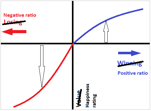
I believe a relationship with a happiness ratio of merely 1 is not sustainable. Even though you have just as many positive experiences as negative ones, the negatives will have a bigger influence on your happiness. Therefore, it is important that the happiness ratio is significantly bigger than 1. A relationship should add happiness to your life, not just sustain it!
I’m no expert, but I believe the happiness ratio of a healthy relationship should be well above 2.
But does my personal data actually confirm this loss aversion theory in relationships?
Absolutely.
I have created a scatter plot below, showing each of the 189 weeks within my data set. I have split the positively influenced weeks from the negatively influenced weeks.
Fighting and cuddling
You can see my average happiness during the weeks in which my relationship was positive and negative. Of course, there are always many other different factors affecting my happiness. But I believe in the law of big numbers. Trends will be visible if the dataset is big enough. I have tracked my happiness daily for more than 3.5 years, and so I believe my results carry some statistical value.
This scatter chart shows that a higher happiness ratio is likely to result in a higher happiness rating. Great. If it were any different, I would have to seriously reconsider my entire relationship.
But you can also see that this loss aversion theory does exist in my data set. The negative influences of my relationship have a much higher impact on my happiness when compared to the positive influences.
Please notice that the horizontal scale is logarithmic. Therefore, the negative happiness ratio (from 0.1 to 1.0) has the same scale as the positive happiness ratio (from 1,0 to 10).
Humans hate losing $5,00 more than we like finding $5,00. In a similar way, I hate the fighting more than I like the cuddling.
“A relationship with an overall happiness ratio of 1,0 is not sustainable”
That is why I believe a relationship with an overall happiness ratio of 1,0 is not sustainable. If you fight just as much as you cuddle, the effect on your happiness will be negative because the fights will have a bigger impact. Again, I’m no expert, but I think a relationship needs a happiness ratio of at least 2 to have a positive influence on your happiness.
My relationship in numbers
So after all that I’ve said, how does my relationship exactly influence my happiness?
I have created the picture below to answer that question.
The effect of my relationship on my happiness is definitely positive. Days influenced by my relationship – whether positively or negatively influenced – are rated higher with 0,04 on average. My happiness on positively influenced days is rated higher by 0,24 when compared to the overall average.
These numbers may not sound impressive to you, but I tend to think otherwise. You see, I am already a really happy person. An overall average happiness rating of 7,78 is already very high. The fact that my girlfriend is able to further increase this is quite impressive to me.
Long-distance relationship?
In addition, we have spent multiple periods in long distance relationships. One of these periods, which I refer to as relationship hell, had a huge impact on us. These results are even more impressive when you consider that we have a spent about 1 year in total apart. I will try to quantify the exact effect of these long-distance relationships in part 2 of this post series. I want to know how much these periods of long-distance decreased my happiness in our relationship.
“The negative events within my relationship have much more impact than the positive events”
What’s also interesting here, is that the loss aversion theory is further confirmed. On the days that I have spent with my girlfriend, the average happiness rating was 7,82. The average rating on the positively influenced days was 8,03: a positive difference of 0,21. However, the average rating on the negatively influenced days was 6,82: a negative difference of 1,00! The negative events within my relationship have much more impact than the positive events.
This may seem alarming. I don’t think it is, however. Remember the pie chart at the start of the post? My relationship influences my happiness positively much more often than it does negatively That’s what compensates the loss aversion theory in my overall happiness.
Closing words
I feel very lucky to be in this relationship and wouldn’t want to change a single thing.
To use the same words as before: yes, I may dislike the fighting more than I do like the cuddling, but at least we cuddle about 5 times more often! 🙂
I love my girlfriend and I’m very happy in love!
If you have any questions about anything, please let me know in the comments below, and I’ll be happy to answer them!
Cheers!

Very awesome presentation of some results! Seeing the scatterplot was a really cool part too – makes the outliers stand out that much more.
It got me thinking – what if you color coded the scatterplot by time spent with your gf? ex, blue is most of the week together, red is most of the week apart. Might be additional data not tracked though.
Thank you for the nice words, Adam!
That’s actually a great idea! I will definitely have to look into that, and might revisit this post when I do. I’ll be honest though, I have yet to find a way to add a color gradient within Google Charts 😎
PS: your comment is the first (honest) comment on my site, so I’m eternally grateful. And hey, if this site ever grows into something bigger, you’ll be in the hall of fame forever 😉 I’m only slightly joking here…